
Visual hierarchy is not just aesthetic decoration. It’s the invisible framework that guides every user decision, from where the eye lands first to what action they take next. Mastering it transforms confusing layouts into intuitive experiences that convert. This guide reveals the core principles, corrects common misconceptions, and provides actionable frameworks you can implement immediately to elevate both digital and print designs.
Table of Contents
- Introduction To Visual Hierarchy
- Core Principles Of Visual Hierarchy
- How Visual Hierarchy Guides User Attention And Decision-Making
- Common Misconceptions And Clarifications About Visual Hierarchy
- Comparing Digital Vs. Print Visual Hierarchy Applications
- Practical Frameworks And Stepwise Implementation Of Visual Hierarchy
- Quantified Benefits And Real-World Case Studies
- Enhance Your Design Projects With Expert Support
- Frequently Asked Questions
Key takeaways
| Point | Details |
|——-|———||
| Strategic prioritization | Visual hierarchy organizes elements to direct attention and improve comprehension across all media types. |
| Engagement boost | Effective hierarchy increases user engagement, task completion speed, and conversion rates measurably. |
| Medium-specific tactics | Digital and print require distinct approaches to spacing, contrast, and responsive adaptation. |
| Beyond size and color | Subtle cues like alignment and spacing often outperform bold contrast in guiding attention. |
| Implementation frameworks | Structured, stepwise methods accelerate design cycles and align stakeholder expectations. |
Introduction to visual hierarchy
Visual hierarchy is the strategic organization and prioritization of design elements to guide user attention toward the most important content first. It functions as a roadmap, directing eyes through layouts in a deliberate sequence that matches user goals and business objectives. This principle applies equally to digital interfaces like websites and mobile apps, and to print materials such as brochures, posters, and magazines.
The fundamental building blocks of visual hierarchy include size, color, typography, spacing, and alignment. Larger elements naturally capture attention before smaller ones. Color contrast creates emphasis, but balancing color contrast is essential because overusing high contrast can overwhelm users and reduce readability. Typography variations like weight, style, and size communicate relative importance instantly. Spacing groups related elements and separates distinct sections, while alignment creates visual flow and order.
Integrating visuals in branding strengthens hierarchy by establishing consistent patterns users recognize across touchpoints. A well-executed visual branding workflow ensures every design element reinforces the intended message and guides attention effectively.
Key visual elements to consider:
- Size establishes immediate importance and draws focus
- Color contrast highlights critical actions or information
- Typography weight and style differentiate content tiers
- Spacing and whitespace create breathing room and grouping
- Alignment directs eye movement and establishes order
Core principles of visual hierarchy
Size signals importance more powerfully than almost any other design attribute. Larger elements attract immediate attention, making them ideal for headlines, primary calls to action, or hero images. Users instinctively interpret bigger as more important, so allocating visual weight strategically ensures priority content gets noticed first.

Color contrast draws the eye but demands restraint. High contrast between foreground and background increases visibility, yet excessive contrast creates visual noise that fatigues users. Balance is the key. Neutral backgrounds with selective pops of color guide attention without overwhelming. Color psychology in web design influences emotional responses and user decisions, making color choices critical beyond mere aesthetics.
Typography variations communicate hierarchy through weight, size, and style. Bold headings establish primary importance, while lighter body text supports readability. Consistent type scales create predictable patterns users learn quickly. Mixing too many fonts or weights fractures attention and confuses hierarchy.
Spacing and alignment create invisible structure that guides eye movement. Generous whitespace groups related content and separates distinct sections, reducing cognitive load. Alignment along a grid establishes visual order and flow, making layouts feel intentional rather than chaotic. A strong visual identity depends on these subtle yet powerful cues.
Psychological aspects influence user comprehension and task efficiency. Familiarity with patterns like left-to-right reading or top-to-bottom scanning shapes how users process layouts. Violating these expectations can disorient, while respecting them accelerates understanding.
Pro Tip: Test hierarchy by squinting at your design. Elements that remain visible are your strongest focal points. If the wrong elements stand out, adjust size, contrast, or spacing to refine the visual flow.
How visual hierarchy guides user attention and decision-making
Eye-tracking research reveals predictable scanning patterns users follow when encountering new content. The Z-pattern describes how eyes move horizontally across the top, diagonally down, then horizontally across the bottom, common in designs with minimal text. The F-pattern shows users scanning horizontally at the top, then down the left side with shorter horizontal movements, typical in text-heavy pages. Understanding these flows lets designers place key content where eyes naturally land.
Time to fixation measures how quickly users focus on specific elements. Clear hierarchy reduces fixation time for priority content, meaning users find what they need faster. Modern website design leverages these principles to create intuitive navigation and conversion paths.
Clear hierarchy leads to faster, more confident user decisions. When options are visually distinct and priorities are obvious, users spend less time deliberating and more time acting. Ambiguous layouts increase hesitation and abandonment. Functional benefits include improved task completion rates, higher engagement metrics, and reduced bounce rates.
“Effective visual hierarchy reduces cognitive load by organizing information into digestible chunks, allowing users to process content efficiently and make decisions with confidence.”
Key attention and decision-making factors:
- Predictable scanning patterns improve content discovery
- Reduced fixation time accelerates user comprehension
- Clear priority signals decrease decision paralysis
- Lower cognitive load increases satisfaction and retention
Common misconceptions and clarifications about visual hierarchy
Many designers assume hierarchy depends solely on size or boldness, but subtle visual cues like spacing and alignment significantly impact scanning speed, improving it by 25% without overt size changes. Functional clarity trumps pure aesthetics. A beautiful design that obscures key information fails users. Hierarchy exists to serve usability first, then aesthetics.
Overuse of contrast harms readability and retention. When everything screams for attention, nothing stands out. Users experience fatigue and disengage. Strategic contrast applied sparingly to truly critical elements maintains impact and preserves readability.
Balancing minimalism and clarity requires nuance. Excessive minimalism can obscure essential information, leaving users confused about next steps or key details. Hierarchy should simplify without stripping away necessary context. Whitespace and simplicity are tools, not ends in themselves.
“Visual hierarchy is not decoration. It is the structural logic that transforms content into comprehension and comprehension into action.”
Misconceptions to avoid:
- Hierarchy is only about size and boldness
- Aesthetics matter more than functional clarity
- High contrast always improves visibility
- Minimalism automatically equals better hierarchy
- Subtle cues have negligible impact on user behavior
Pro Tip: Conduct quick usability tests by asking colleagues unfamiliar with your design to identify the three most important elements. If they cannot, your hierarchy needs refinement.
Comparing digital vs. print visual hierarchy applications
Digital hierarchy must adapt to responsive layouts and scrolling behavior. Screen sizes vary wildly, from smartphones to desktops, requiring flexible designs that maintain hierarchy across breakpoints. Scrolling introduces temporal sequencing, where content reveals progressively rather than all at once. Interactivity allows dynamic changes, like hover states or expandable sections, adding layers of hierarchy unavailable in print.
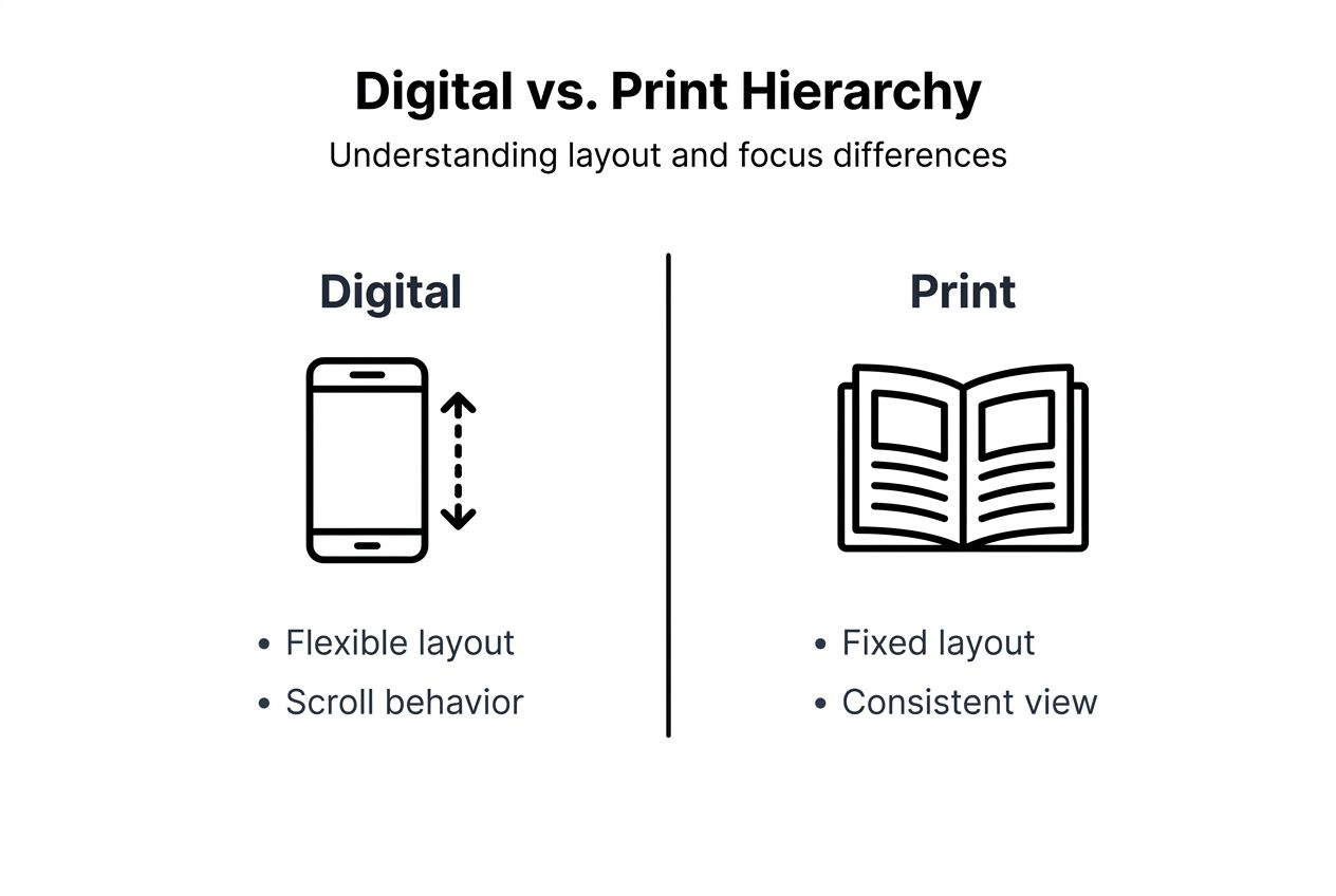
Print hierarchy benefits from fixed layouts and physical reading patterns. Designers control the exact viewing context, knowing page dimensions and reading distance. Physical materials follow predictable top-to-bottom, left-to-right flows without the variability of digital scrolling. Print lacks interactivity, demanding that hierarchy communicate everything statically.
Screen resolution and pixel density affect digital hierarchy choices. High-resolution displays render fine details sharply, while lower resolutions can blur subtle distinctions. Digital typography must account for rendering variations across devices and browsers.
Print allows for static placement and controlled viewing context. Once printed, layouts remain consistent. Designers know users will experience the entire page simultaneously, enabling sophisticated compositional hierarchies that digital scrolling disrupts.
| Aspect | Digital Hierarchy | Print Hierarchy |
|---|---|---|
| Layout flexibility | Responsive, adapts to screen sizes | Fixed dimensions, static |
| User interaction | Scrolling, clicking, hover states | Passive viewing only |
| Viewing context | Variable devices and resolutions | Controlled page size and distance |
| Content revelation | Progressive through scrolling | Simultaneous full-page view |
| Design constraints | Must account for breakpoints | Benefits from compositional control |
Practical frameworks and stepwise implementation of visual hierarchy
Stepwise implementation of visual hierarchy should begin with defining content priorities, followed by sketching layouts emphasizing these priorities using size, contrast, and spacing, improving delivery speed and final output quality. Aligning priorities with user goals and business objectives ensures hierarchy serves both audiences effectively.
Start by auditing content and ranking it by importance. What must users see first? What actions drive business value? Create a tiered framework with primary, secondary, and tertiary elements. Primary elements demand immediate attention, secondary elements support understanding, and tertiary elements provide optional depth.
Sketch layouts emphasizing size, contrast, spacing, and alignment before diving into detailed design. Low-fidelity wireframes clarify hierarchy without aesthetic distractions. Test these sketches with stakeholders to align vision early, reducing costly revisions later.
Iterate designs with testing and feedback to refine hierarchy. A/B testing reveals which hierarchies drive better engagement and conversions. User testing uncovers confusion or missed content. Iterative refinement based on real data beats intuition alone.
Effective team communication speeds approvals and reduces revisions. Document hierarchy decisions and rationale so stakeholders understand why elements are sized, colored, or positioned as they are. This transparency builds trust and streamlines feedback cycles. Creating branded visuals with consistent hierarchy strengthens recognition and usability.
- Define content priorities aligned with user and business goals
- Create a tiered framework: primary, secondary, tertiary elements
- Sketch low-fidelity wireframes emphasizing hierarchy first
- Test sketches with stakeholders to align vision early
- Iterate with A/B and user testing to validate effectiveness
- Document decisions to streamline team communication and approvals
Pro Tip: Use grayscale mockups to evaluate hierarchy without color distractions. If the hierarchy works in grayscale, color will only enhance it. If it fails in grayscale, color cannot save it.
Quantified benefits and real-world case studies
Conversion rate improvements linked to clear hierarchy in emails and landing pages are substantial. Studies show redesigns emphasizing visual hierarchy can lift conversions by 20% to 50% by making calls to action unmistakable and reducing friction. Email marketing campaigns leveraging strong hierarchy see higher click-through rates and engagement.
User engagement metrics increase with structured visual flow. Time on page, scroll depth, and interaction rates all improve when hierarchy guides users smoothly through content. Clear paths reduce bounces and increase exploration of related content.
Case studies illustrate real uplift in task completion and marketing ROI. E-commerce sites redesigning product pages with stronger hierarchy report faster purchase decisions and lower cart abandonment. Designing ecommerce homepages with hierarchy-driven layouts boosts conversions measurably.
Hierarchy reduces design iteration cycles and aligns stakeholder vision. When designers apply frameworks systematically, feedback becomes more constructive and revisions decrease. Stakeholders see intent clearly, reducing subjective debates and accelerating approvals. The role of design in marketing becomes tangible when hierarchy delivers measurable outcomes.
Data-driven validation builds executive buy-in for design investments. Showing quantified improvements in engagement, conversions, and ROI justifies design budgets and positions design as a strategic asset, not a cost center.
| Metric | Before Hierarchy Optimization | After Hierarchy Optimization | Improvement |
|---|---|---|---|
| Landing page conversion rate | 2.5% | 3.8% | +52% |
| Email click-through rate | 1.8% | 2.7% | +50% |
| Average time on page | 45 seconds | 72 seconds | +60% |
| Task completion rate | 62% | 81% | +31% |
Key quantified benefits:
- Conversion rates increase by 20% to 50% with optimized hierarchy
- Engagement metrics like time on page rise significantly
- Task completion improves, reducing user frustration
- Design iteration cycles shorten, saving time and budget
- Executive buy-in strengthens with data-driven results
Enhance your design projects with expert support
Implementing effective visual hierarchy demands both strategic thinking and technical skill. Whether you are launching a new brand, refreshing your online presence, or optimizing campaigns, professional support accelerates results. Our team at Lind Creative specializes in strategy-driven design and marketing that blends creativity with measurable outcomes.
Explore the best website builders for agencies to find platforms that support sophisticated visual hierarchy and responsive design. Discover how email marketing strategies leverage hierarchy to boost engagement and sales in 2026. Review our case studies to see proven results from applying visual hierarchy principles in real-world web and email projects. We help you attract, convert, and grow through designs that perform.
Frequently asked questions
What is visual hierarchy in design?
Visual hierarchy is the arrangement and prioritization of design elements to guide user attention toward the most important content first. It organizes information so users can scan, comprehend, and act efficiently. Effective hierarchy improves clarity and reduces cognitive load.
How does visual hierarchy improve user experience?
It facilitates faster content scanning and decision-making by establishing clear priorities. Users spend less time searching and more time engaging with content that matters. Reduced cognitive load leads to higher satisfaction and task completion rates.
What are common mistakes when using visual hierarchy?
Over-reliance on size and boldness while ignoring spacing and alignment is frequent. Overuse of contrast hurts readability and fatigues users. Excessive minimalism can obscure key information, leaving users confused about next steps or critical details.
How does visual hierarchy differ between digital and print media?
Digital requires responsive adjustments and considers scrolling behavior, adapting to variable screen sizes and user interactions. Print uses fixed layouts and leverages physical reading patterns with static, controlled viewing contexts. Each medium balances clarity and minimalism differently based on its unique constraints and opportunities.
Recommended
- Visual Branding Workflow for Powerful Brand Impact – Lind Creative
- 7 User Experience Improvement Ideas for Luxury Brands – Lind Creative
- The Impact of Responsive Design on User Experience: Optimizing for a Multi-Device World – Lind Creative
- The Essential Guide to Visuals in Branding – Lind Creative