
Every marketing director knows the frustration of investing in traffic only to see lackluster conversion rates on key eCommerce landing pages. Understanding why visitors hesitate or drop off matters more than ever when you are targeting upscale American shoppers. This guide reveals how single focused objectives and data-driven design adjustments can transform underperforming pages into conversion engines tailored for your unique audience.
Table of Contents
- Step 1: Define Your Landing Page Objectives
- Step 2: Analyze Existing User Behavior Data
- Step 3: Refine Your Page Design For Clarity
- Step 4: Implement High-Impact Conversion Elements
- Step 5: Test And Measure Conversion Improvements
Quick Summary
| Essential Insight | Explanation |
|---|---|
| 1. Define a single objective | Clearly identify one main purpose for your landing page to increase its effectiveness and guide design decisions. |
| 2. Analyze user behavior data | Use analytics to understand visitor actions, identify patterns, and discover conversion opportunities before making changes. |
| 3. Simplify your page design | Keep your landing page clear of distractions to facilitate user focus on the primary call to action and enhance conversions. |
| 4. Use impactful conversion elements | Incorporate headlines, calls to action, and social proof strategically to drive visitor engagement and conversions. |
| 5. Test and measure systematically | Implement A/B testing on specific elements to gather data-driven insights, ensuring continuous optimization for better results. |
Step 1: Define your landing page objectives
Before you design a single element or write a single word, you need to know what success looks like for your landing page. Clear objectives act as your north star, guiding every decision from copy to call-to-action buttons. Without them, you’re essentially throwing visitors at a page and hoping something sticks.
Start by asking yourself what you want visitors to do when they arrive. Are you capturing email addresses for your newsletter? Encouraging product purchases? Requesting a demo or consultation? Landing pages are most effective when they’re designed for a single focused objective, whether that’s obtaining leads or making sales. The more specific you are here, the better your results.
Consider these core objective types:
- Lead capture – collecting contact information through forms
- Sales conversion – completing a purchase or transaction
- Appointment booking – scheduling consultations or calls
- Content access – allowing users to download resources or unlock information
- Registration – signing users up for accounts, events, or trials
Once you’ve identified your primary objective, define the measurable success metrics tied to it. If you’re capturing leads, what conversion rate are you targeting? If you’re driving sales, what’s your revenue goal? Having concrete numbers makes it easier to test, optimize, and prove ROI to stakeholders.
Here’s a summary of common landing page objectives and their business impact:
| Objective Type | Main Action Requested | Typical Success Metric | Business Impact |
|---|---|---|---|
| Lead capture | Submit contact form | Conversion rate, leads count | Builds sales pipeline |
| Sales conversion | Complete purchase | Revenue, sales volume | Direct revenue growth |
| Appointment booking | Schedule call | Number of bookings | Enables high-value conversations |
| Content access | Download resource | Download rate | Nurtures leads, educates visitors |
| Registration | Sign up for account | Sign-up completions | Expands user base |
Your objectives should also be narrowly focused. When you ask your visitors to do multiple things—fill out a form, watch a video, buy now, and sign up for a webinar—you dilute the effectiveness of your page. Research shows that isolated visitors with a single focused objective increase conversion likelihood significantly. One clear ask beats five competing ones every time.
Think about your audience too. Different visitor segments may have different needs. An eCommerce director exploring your services for the first time might want a consultation, while someone returning for a specific solution might be ready to buy. Understanding these nuances helps you align your objective with visitor intent.
Define one primary objective per landing page. Everything else—design, copy, offers—flows from that single decision.
Pro tip: Document your landing page objectives in a simple one-pager before starting design work. Include your primary goal, target audience, success metrics, and the specific action you want visitors to take. This clarity keeps your entire team aligned and prevents scope creep.
Step 2: Analyze existing user behavior data
You already have valuable information hiding in your analytics. Before making changes to your landing page, dig into what your current visitors are actually doing. This data reveals patterns, pain points, and opportunities that gut feelings alone can’t provide.
Start by examining your traffic sources and user segments. Where are your visitors coming from? Are they arriving from paid ads, organic search, email campaigns, or direct links? Each source typically brings different expectations and behaviors. A visitor from a targeted paid ad behaves differently than someone who landed on your page through a generic search result.
Next, analyze how users interact with your page itself. User engagement with visual elements, content strategy, and navigation performance tells you what’s working and what’s falling flat. Look at these key metrics:
- Scroll depth – how far down the page visitors scroll before leaving
- Click-through rates – which buttons and links get the most attention
- Time on page – how long visitors spend engaging with content
- Form abandonment – where users drop off when filling out contact forms
- Exit pages – which specific sections cause visitors to leave
Use tools like Google Analytics, heatmaps, or session recordings to see the full picture. Heatmaps show you exactly where users click and hover. Session recordings let you watch actual visitor behavior in real time, revealing frustrations that numbers alone don’t capture.

Look for consumption patterns and user interactions across your digital platform to identify conversion bottlenecks. If 80% of visitors abandon your form on the third field, that’s your signal to simplify. If people scroll past your main offer, your positioning might be wrong.
Compare your data against industry benchmarks for your specific sector. An eCommerce landing page typically converts at 2–5%, while B2B services might see 5–10%. If you’re significantly below benchmark, you have clear room for improvement.
Data reveals truth. Your assumptions about what visitors want matter far less than what they actually do.
Pro tip: Set up custom conversion tracking and UTM parameters on your traffic sources now, before you make optimization changes. This lets you compare “before” and “after” performance accurately and prove which changes actually moved the needle.
Step 3: Refine your page design for clarity
Clarity wins. A confusing landing page loses visitors faster than a slow-loading one. Your design should eliminate distractions and guide visitors toward one clear action, with every element serving a purpose.
Start by removing unnecessary navigation. Most landing pages don’t need your full website menu. Visitors coming from ads or emails have a specific intent, and a cluttered navigation bar tempts them away from your goal. Keep navigation minimal or eliminate it entirely on high-converting pages.
Structure your content with a logical hierarchy that’s easy to follow. Clear headings, labeled regions, and accessible navigation landmarks help visitors understand what they’re reading and why. This clarity benefits everyone, not just users with accessibility needs.
Focus on these core design elements:
- Hero section – a compelling headline and subheadline that immediately communicate your offer
- Clear call to action – a prominent button or form that stands out visually
- Emphasized benefits – concise explanations of what visitors gain
- Social proof – testimonials or case studies that build trust
- FAQs – answers to common objections before visitors ask them
Use white space generously. Crowded pages feel overwhelming and make visitors work too hard. White space doesn’t mean empty; it means breathing room that guides the eye naturally down the page toward your primary offer.
Choose typography and colors intentionally. Large, readable fonts matter more than design trends. Your heading should be instantly readable from three feet away. Colors should create contrast, not confusion. A clear landing page that avoids distractions and focuses on core elements significantly increases conversion likelihood.
Test your design on mobile devices. Over 60% of traffic often comes from mobile, yet many eCommerce brands optimize only for desktop. A beautifully designed page that’s hard to use on phones loses half your visitors automatically.
Simplicity is sophistication. Every element should earn its place by moving visitors closer to conversion.
Pro tip: Use the “squint test” to evaluate clarity. Step back from your page design and squint your eyes. You should still see the hierarchy, main offer, and call to action. If they disappear, your design needs refinement.
Step 4: Implement high-impact conversion elements
Now you refine the specific components that drive conversions. These elements work together to guide visitors toward your desired action. Each one serves a strategic purpose backed by user behavior data.
Start with your headline. This is the first thing visitors read, and it determines whether they stay or leave. Your headline should immediately communicate your core value proposition. Instead of generic claims, be specific about what visitors gain. “Increase Sales by 40%” beats “Better Business Solutions” every time.
Your call-to-action button deserves special attention. Make it visually distinct with contrasting colors and clear, action-oriented text. “Get Started” or “Claim Your Consultation” performs better than vague labels like “Submit” or “Click Here.” Button placement matters too—typically above the fold and again near the bottom of your page.
Incorporate social proof through testimonials, ratings, and case studies to build trust. Real customers sharing real results overcome skepticism that marketing copy alone cannot. Feature specific metrics when possible: “97% of clients see results within 30 days” is more powerful than “customers love us.”
Optimize your form strategically. Most visitors abandon forms that ask for too much information too early. Start with essential fields only:
- Name and email address for lead capture
- One qualifying question relevant to your offer
- Phone number (optional on first submission)
Forms requesting industry, company size, and budget before building rapport dramatically increase abandonment rates. Save additional questions for follow-up conversations.
Implement data-driven adjustments through behavioral analytics and A/B testing to reveal what resonates with your specific audience. Test one element at a time—headline variations, button colors, form fields, or benefit statements. This methodical approach shows you which changes actually move conversions.
Ensure fast load times and complete mobile responsiveness. Slow pages lose visitors exponentially, and unoptimized mobile experiences cost conversions from the majority of your traffic.
Great conversion elements feel invisible to users. They guide naturally without appearing manipulative or pushy.
Pro tip: Start with your highest-traffic pages and test one conversion element change per week. Document results in a simple spreadsheet, then roll successful changes into your standard template before testing the next element.
Step 5: Test and measure conversion improvements
Optimization without measurement is just guessing. You need structured testing to identify what actually works for your audience. This step transforms assumptions into data-driven decisions that stick.
Begin with A/B testing, the most reliable way to understand what drives conversions. Pick one element to test—a headline, button color, form length, or benefit statement. Create two versions of your landing page identical except for that single variable. Send roughly equal traffic to each version and measure results over at least one week, ideally two.
To help you plan testing, here’s a comparison of A/B testing versus multivariate testing for conversion optimization:
| Testing Method | Focus | Typical Use Case | Pros | Cons |
|---|---|---|---|---|
| A/B Testing | One variable change | Headline or button test | Easy to set up | Limited to single change |
| Multivariate Testing | Multiple variable changes | Test different designs simultaneously | Finds best combinations | Requires more traffic |
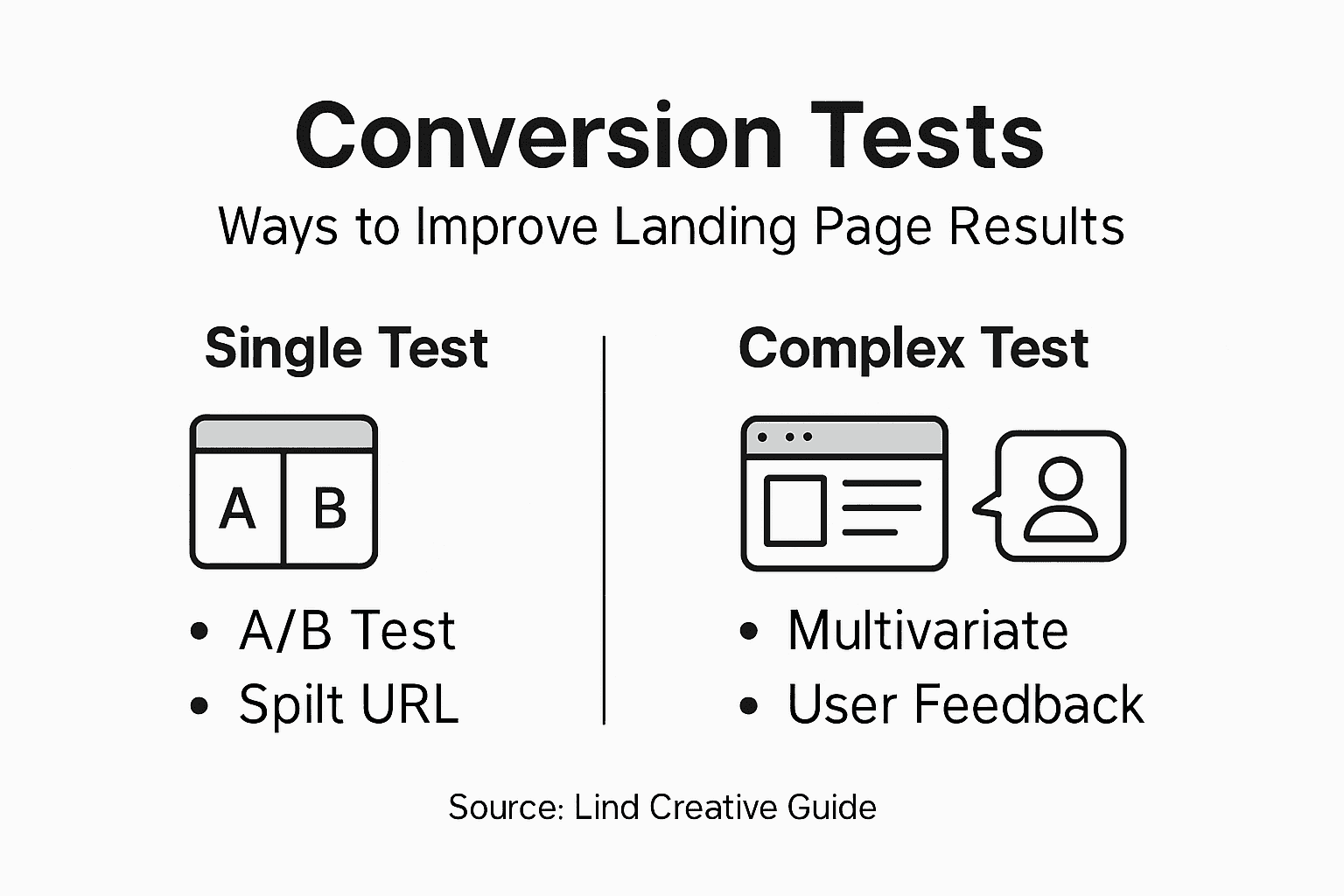
Approach testing with clear methodology. Testing with structured methods such as A/B testing with clear goals and hypotheses helps you evaluate success reliably. Before you launch, define your hypothesis: “We believe changing the button color from blue to red will increase conversions by 15% because color psychology shows red drives urgency.” This clarity ensures you’re testing with purpose, not randomly hoping something works.
Track these critical metrics:
- Conversion rate – percentage of visitors completing your desired action
- Click-through rate – how many visitors click your call-to-action
- Form completion rate – percentage of started forms submitted
- Bounce rate – percentage of visitors who leave without interaction
- Average time on page – engagement duration
Monitor website speed using tools like PageSpeed Insights and browser network monitors to ensure performance improvements align with conversion gains. A page that converts better but loads slower isn’t truly optimized. Speed and conversion rates work together.
Document everything systematically. Create a simple spreadsheet tracking each test, the hypothesis, results, and whether you kept the change. This record becomes your knowledge base for future optimizations. After testing 10 changes, patterns emerge about what resonates with your specific audience.
Measure for statistical significance. Small sample sizes create misleading results. Most experts recommend at least 100 conversions per variation before declaring a winner. If your traffic is lower, run tests longer to gather sufficient data.
One solid insight from real data beats a hundred opinions from the smartest person in the room.
Pro tip: Test one element every two weeks and commit to running tests for at least 14 days minimum. This discipline builds compounding conversion gains, turning small 5% improvements into 50% total uplift over a few months.
Unlock Higher Conversion Rates with Expert Landing Page Solutions
Struggling to boost your landing page conversions despite your best efforts to define clear objectives and refine design elements The challenge many face is turning insights into results by implementing strategic, data-driven changes that truly resonate with your audience Lind Creative specializes in crafting focused, high-impact landing pages that eliminate distractions and guide visitors to take action Our approach integrates the best practices outlined in this article including clarity in calls-to-action, optimized form strategies, and targeted messaging aligned with visitor intent
Ready to stop guessing and start growing Your landing page is the gateway to your business success and Lind Creative’s expert team is here to elevate it through proven Digital Marketing – Lind Creative techniques and creative Web Design – Lind Creative that captures attention and drives conversions Visit Lind Creative today to unlock a tailor-made strategy that not only looks great but performs seamlessly across all devices Don’t let potential customers slip away turn your landing pages into powerful growth engines now
Frequently Asked Questions
What is the first step to optimize landing pages for maximum conversions?
To optimize landing pages effectively, the first step is to define clear objectives. Identify what specific action you want visitors to take, such as signing up for a newsletter or making a purchase.
How can I analyze user behavior on my landing page?
You can analyze user behavior by examining key metrics like scroll depth, click-through rates, and time on page. Use this data to identify patterns and areas for improvement, which will help you refine your landing page for better user engagement.
What design elements should I focus on for higher conversion rates?
Focus on simplifying your design by removing unnecessary navigation, ensuring clarity in your message, and using strong call-to-action buttons. Prioritize a clean layout with visual hierarchy to guide visitors toward taking the desired action.
How do I implement effective conversion elements on my landing page?
Implement effective conversion elements by creating a compelling headline that communicates value and using social proof to build trust. Ensure your call-to-action is clear and prominent, guiding visitors to complete the desired action easily.
What testing methods should I use to improve conversions?
Use A/B testing to compare variations of a single element on your landing page, such as headlines or button colors. This method helps you determine what changes resonate with your audience and can lead to measurable improvements in conversion rates.
How often should I test my landing page for optimal results?
Aim to test one element of your landing page every two weeks to collect reliable data. This regular testing approach allows you to make incremental improvements, potentially leading to substantial gains in conversions over time.
Recommended
- How to Create Service Landing Page for Lead Generation – Lind Creative
- How to Optimize Website Conversions for eCommerce Success – Lind Creative
- Defining High-Converting Websites for Results-Driven Growth – Lind Creative
- What Is a Landing Page and Its Impact on Hospitality Leads – Lind Creative